Barney's Basic Guide (With examples) 🎯
Overview
This guide attempts to guide our fellow Sylvanas programmers into building their own custom user interfaces for their plugins. For this, I have created a step-by-step guide basic that anyone with programming knowledge can follow (hopefully, open to suggestions), adding multiple code examples and exercises to practise. The idea is to give you a starting point, so you can keep learning and evolving yourself afterwards.
🎯 Barney's Basic Guide 🎯
With this guide, our goal is to generate the following UI: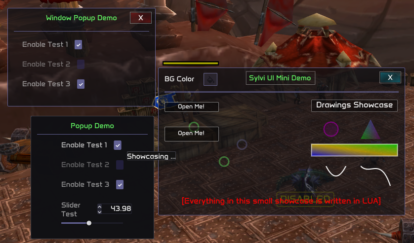
All the code that generates what we can see in the previous image will be extensively explained. The code is obviously open source for you to practise and be creative.
Basics - 0
The basics - Getting StartedThis module is located within the core.menu module. All our custom UI code will be rendered within a "Window". Each window is, and must be treated as, an independent object. Therefore, each individual window that we generate will have its own sepparate visuals and code. Before begining, these are the modules that will be required:
---@type color
local color = require("common/color")

---@type vec2
local vec2 = require("common/geometry/vector_2")

---@type enums
local enums = require("common/enums")
Basics - 1
The basics - Creating a Window Object
As previously stated, each window must be an individual object. So, same like with menu elements, we are going to generate a window as follows:
local test_window = core.menu.window("Test window")
-- Important: every window must have a unique identifier.
-- In this case, the identifier is "Test window".
Now that we already have our window object, we have to set its initial position and size. (This can be changed later, either by user input or by code, on the rendering callback, however, it's important to always set the initial position and size, which will be used as default.)
Size and position are of type vec2, since we need X and Y axis to define both magnitudes. See vec2
We don't want size or position to be saved aftear each injection:
We can just set the hardcoded position and size as follows:
local initial_size = vec2.new(200, 200)
window:set_initial_size(initial_size)

local initial_position = vec2.new(500, 500)
window:set_initial_position(initial_position)
Case 2
We want size or position to be saved aftear each injection:
In this case, we also have to generate "ghost" sliders that will save the last known value of position and size of the window, since menu elements are the only
available resources that allows us to save information between different injections.
local window_position_elements =
{
    x = core.menu.slider_int(0, 10000, 250, "test_window_x_initial_position"),
    y = core.menu.slider_int(0, 10000, 360, "test_window_y_initial_position"),
}

local window_size_elements =
{
    x = core.menu.slider_int(0, 10000, 250, "test_window_x_initial_size"),
    y = core.menu.slider_int(0, 10000, 360, "test_window_y_initial_size"),
}
Now that we have our sliders defined (you can also use float sliders if you want more precision), we can actually set the window's initial size and position:
local initial_size = vec2.new(window_size_elements.x:get(), window_size_elements.y:get())
test_window:set_initial_size(initial_size)

local initial_position = vec2.new(window_position_elements.x:get(), window_position_elements.y:get())
test_window:set_initial_position(initial_position)
Everything that we used up to this point must be called OUTSIDE the render callback.
Basics - 2
The basics - Rendering our First Window
Everything's ALMOST ready for us to render things and have fun. There is only one thing missing: we need to use the window's special rendering callback! We will use an anonymous function, so we can start rendering directly, but like with all other callbacks,
you can define a function and then call the callback passing the said function.
core.register_on_render_window_callback(function()

end)
Now that we have our callback defined, let's actually start rendering. To render any window, we must use the window:begin function. This function's last parameter is another function, and from now on, almost all code will be placed inside this last function. I know it might sound confusing at first, but trust me, it's very simple. You will understand everything with this next example:
core.register_on_render_window_callback(function()
    -- I know all these parameters might overwhelm you at the beginning, but don't worry since all
    -- these parameters are straightforward and pretty much self-explanatory.

    -- Parameter 1: Resizing flags -> Accepts window_resizing_flags enum member:    .NO_RESIZE or 0,
    --                                                                              .RESIZE_WIDTH,
    --                                                                              .RESIZE_HEIGHT,
    --                                                                              .RESIZE_BOTH_AXIS

    -- .NO_RESIZE: The draggable resizing areas will be completely disabled,
    --  making it impossible for the user to change the window's size.
    -- .RESIZE_WIDTH: Only the lateral draggable zone will be enabled, so the user will only be able to increase the window's width.
    -- .RESIZE_HEIGHT: Only the bottom draggable zone will be enabled, so the user will only be able to increase the window's height.
    -- .RESIZE_BOTH_AXIS: The bottom-right draggable zone will be enabled, so the user will be able to modify both, width and height.

    -- Parameter 2: Is adding cross -> Accepts Boolean. The cross refers to the top right X that when pressed will make the window invisible. If false, no cross will be rendered,
    -- so you will have to manually handle a way to close and open the window (eg. custom buttons).

    -- Parameter 3: Background color -> Accepts Color

    -- Parameter 4: Border color -> Accepts Color

    -- Parameter 5: Cross style flag -> Accepts window_cross_visuals enum member:   DEFAULT = 0,
    --                                                                              PURPLE_THEME = 1,
    --                                                                              GREEN_THEME = 2,
    --                                                                              RED_THEME = 3,
    --                                                                              BLUE_THEME = 4,
    --                                                                              NO_BACKGROUND = 5,
    --                                                                              ONLY_HITBOX = 6,
    --                                                                              NO_BORDER = 7,
    --                                                                              NO_BACKGROUND_AND_NO_BORDER = 8,
    --                                                                              NO_CROSS = 9

    -- The cross style enum names are self explanatory, but I advise you to play with all these values and see how they change.

    -- There are up to 3 extra possible parameters that are optional before we add the function call, which is always the last parameter no matter what.
    -- These parameters are just extra flags that we can add that will alter the way the window behaves. They are inside the enums.window_enums.window_behaviour_flags.
    -- These flags are:

    -- .NO_MOVE: Disables the window's movement, so the user won't be able to move the window by dragging it.
    -- .NO_SCROLLBAR: Disables scrollbars for the window.
    -- .ALWAYS_AUTO_RESIZE: Window will automatically resize according to the elements, always according to the dynamic spacing size (see advanced guide)


    -- NOTE: To use the default color, we need to pass color.new(0,0,0,0)

    test_window:begin(enums.window_enums.window_resizing_flags.RESIZE_BOTH_AXIS, true, color.new(0,0,0,0),
    color.new(0,0,0,0), enums.window_enums.window_cross_visuals.BLUE_THEME, function()


    end)
end)
Basics - Last
The basics - Summary
Up to this point, this is all the code that we have created:
---@type color
local color = require("common/color")

---@type vec2
local vec2 = require("common/geometry/vector_2")

---@type enums
local enums = require("common/enums")

local test_window = core.menu.window("Test window")
-- Important: every window must have a unique identifier.
-- In this case, the identifier is "Test window".

local window_position_elements =
{
    x = core.menu.slider_int(0, 10000, 500, "test_window_x_initial_position_"),
    y = core.menu.slider_int(0, 10000, 500, "test_window_y_initial_position_"),
}

local window_size_elements =
{
    x = core.menu.slider_int(0, 10000, 500, "test_window_x_initial_size_"),
    y = core.menu.slider_int(0, 10000, 300, "test_window_y_initial_size_"),
}

local initial_size = vec2.new(window_size_elements.x:get(), window_size_elements.y:get())
test_window:set_initial_size(initial_size)

local initial_position = vec2.new(window_position_elements.x:get(), window_position_elements.y:get())
test_window:set_initial_position(initial_position)

core.register_on_render_window_callback(function()
    -- I know all these parameters might overwhelm you at the beginning, but don't worry since all these parameters are straightforward and pretty much self-explanatory.

    -- Parameter 1: Resizing flags -> Accepts window_resizing_flags enum member:    .NO_RESIZE or 0,
    --                                                                              .RESIZE_WIDTH,
    --                                                                              .RESIZE_HEIGHT,
    --                                                                              .RESIZE_BOTH_AXIS

    -- .NO_RESIZE: The draggable resizing areas will be completely disabled, making it impossible for the user to change the window's size.
    -- .RESIZE_WIDTH: Only the lateral draggable zone will be enabled, so the user will only be able to increase the window's width.
    -- .RESIZE_HEIGHT: Only the bottom draggable zone will be enabled, so the user will only be able to increase the window's height.
    -- .RESIZE_BOTH_AXIS: The bottom-right draggable zone will be enabled, so the user will be able to modify both, width and height.

    -- Parameter 2: Is adding cross -> Accepts Boolean. The cross refers to the top right X that when pressed will make the window invisible. If false, no cross will be rendered,
    -- so you will have to manually handle a way to close and open the window (eg. custom buttons).

    -- Parameter 3: Background color -> Accepts Color

    -- Parameter 4: Border color -> Accepts Color

    -- Parameter 5: Cross style flag -> Accepts window_cross_visuals enum member:   DEFAULT = 0,
    --                                                                              PURPLE_THEME = 1,
    --                                                                              GREEN_THEME = 2,
    --                                                                              RED_THEME = 3,
    --                                                                              BLUE_THEME = 4,
    --                                                                              NO_BACKGROUND = 5,
    --                                                                              ONLY_HITBOX = 6,
    --                                                                              NO_BORDER = 7,
    --                                                                              NO_BACKGROUND_AND_NO_BORDER = 8,
    --                                                                              NO_CROSS = 9

    -- The cross style enum names are self explanatory, but I advise you to play with all these values and see how they change.

    -- There are up to 3 extra possible parameters that are optional before we add the function call, which is always the last parameter no matter what.
    -- These parameters are just extra flags that we can add that will alter the way the window behaves. They are inside the enums.window_enums.window_behaviour_flags.
    -- These flags are:

    -- .NO_MOVE: Disables the window's movement, so the user won't be able to move the window by dragging it.
    -- .NO_SCROLLBAR: Disables scrollbars for the window.
    -- .ALWAYS_AUTO_RESIZE: Window will automatically resize according to the elements, always according to the dynamic spacing size (see advanced guide)

    -- NOTE: To use the default color, we need to pass color.new(0,0,0,0)

    test_window:begin(enums.window_enums.window_resizing_flags.RESIZE_BOTH_AXIS, true, color.new(0,0,0,0),
    color.new(0,0,0,0), enums.window_enums.window_cross_visuals.BLUE_THEME, function()


    end)
end)
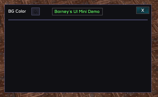
As you can see, if we remove the comments, it's a pretty short and straightforward code. This is what we will be seeing on screen after we run this code:
Intermediates - 1
The Intermediates - Rendering The Title
I am going to introduce the "dynamic" positions offsets, since this is something we need for our showcase. However, this is more advanced, and therefore will be explained in detail in the "The Advanceds" part of the guide.
For now, you can just copy and paste the code and play with its parameters.
If you go back to the first image, you can notice there is a color-picker on the top-left of the window. Yes, we can render menu elements inside our windows, so you will be able to make your own menus for your plugins,
visual guides or whatever your imagination is capable of.
First, we will create and render this color picker, since it's the first element that appears on the window.
--- note: this is a menu element declaration, so it must be outside of the callback function.
local color_picker_test = core.menu.colorpicker(bg_color, "color_picker_test_id_1")

test_window:add_menu_element_pos_offset(vec2.new(13, 13))
color_picker_test:render("BG Color")
test_window:add_menu_element_pos_offset(vec2.new(-3, -3))
Now, the colorpicker should be appearing on the top-left of the window. Let's move on to render the title:
    local title_text = "Barney's UI Mini Demo"
    -- With this function we get the exact X position offset required to add to the current dynamic position so the text is in the center of the window:
    local text_centered_x_pos = window:get_text_centered_x_pos(title_text)
    -- We add the X position offset that we just calculated, and also we adjust the Y position:
    window:add_menu_element_pos_offset(vec2.new(text_centered_x_pos, -32))
    -- Finally, we just render the text on the dynamic position that we just set:
    window:add_text_on_dynamic_pos(color.green_pale(255), title_text)
Now that we just rendered the title and the color picker, let's add something to highlight the title. For example, a rectangle:
window:render_rect(vec2.new(text_centered_x_pos - text_size.x / 20 - 3, 7.5), vec2.new(text_centered_x_pos + text_size.x * 1.05 - 1, 35), color.white(100), 0, 1.0)
And now we just have to add some separators, so it's clear that this is the title preview, right?
    window:add_separator(3.0, 3.0, 15.0, 0.0, color.new(100, 99, 150, 255))
    window:add_separator(3.0, 3.0, 17.0, 0.0, color.new(100, 99, 150, 255))
So, up to this point, this should be how our window's begin function code is looking like:
As you will see soon, we can use the color picker that we just declared to set the color of our window.
    test_window:begin(enums.window_enums.window_resizing_flags.RESIZE_BOTH_AXIS, true, color_picker_test:get_color(),
    color.new(0,0,0,0), enums.window_enums.window_cross_visuals.BLUE_THEME, function()
        test_window:add_menu_element_pos_offset(vec2.new(13, 13))
        color_picker_test:render("BG Color")
        test_window:add_menu_element_pos_offset(vec2.new(-3, -3))

        local title_text = "Barney's UI Mini Demo"
        -- With this function we get the exact X position offset required to add to the current dynamic position so the text is in the center of the window:
        local text_centered_x_pos = window:get_text_centered_x_pos(title_text) -- This function accepts a string, returns a number (which is the X offset)

        -- We add the X position offset that we just calculated, and also we adjust the Y position:
        window:add_menu_element_pos_offset(vec2.new(text_centered_x_pos, -32)) -- This function accepts a vec2, returns nothing (the parameter is the position offset)

        -- Finally, we just render the text on the dynamic position that we just set:
        window:add_text_on_dynamic_pos(color.green_pale(255), title_text) -- This function accepts a color and a string. This just renders the string with the color.

        local text_size = window:get_text_size(title_text)
        -- Now we render the rectangle to highlight the title:
        -- This function accepts start_position (vec2), end_position (vec2), color, rounding, thickness and extra flags. The extra flags are covered in the docs, in the function info.
        window:render_rect(vec2.new(text_centered_x_pos - text_size.x / 20 - 3, 12.0), vec2.new(text_centered_x_pos + text_size.x * 1.05 - 1, 37), color.white(100), 0, 1.0)

        -- We finished rendering the title, so let's add some separators:
        -- This function accepts the following parameters: separation from right offset (number), separation from left offset (number), y offset (number), width_offset (number) and color.
        window:add_separator(3.0, 3.0, 15.0, 0.0, color.new(100, 99, 150, 255))
        window:add_separator(3.0, 3.0, 17.0, 0.0, color.new(100, 99, 150, 255))
    end)
This is how our window should be looking like in game with the current code:
Intermediates - 2
The Intermediates - PopupsWe can also spawn popups (or other windows) from our window. To do this, we obviously need something that triggers the event of the popup appearing. To achieve this, we will usually need buttons. We can use either the buttons that are given from core.menu or we can make our own. In this case, since it's a guide, we will make the buttons ourselves.
First, we need to define the button bounds, and then we just need to control the cursor positioning and behaviour.
    -- top-left position of the button rect
    local open_popup_rect_v1 = vec2.new(13, 70)
    -- bot-right position of the button rect
    local open_popup_rect_v2 = vec2.new(123, 90)

    -- we can change alpha if the mouse is hovering our rect, so the user gets visual feedback and knows that the button does something.
    local alpha = 120
    if window:is_mouse_hovering_rect(open_popup_rect_v1, open_popup_rect_v2) then
        alpha = 255
    end

    -- now, we just need to render the rect accordingly

    -- this is the background of the rect
    window:render_rect_filled(open_popup_rect_v1, open_popup_rect_v2, color.black(alpha), 1.0)
    -- this is the borders of the rect
    window:render_rect(open_popup_rect_v1, open_popup_rect_v2, color.white(alpha), 1.0, 1.0)

    window:render_text(enums.window_enums.font_id.FONT_SMALL, vec2.new(40, 71), color.white(255), "Open Me!")

    -- if the window is clicked, then we can do whatever. In this case, we are going to open a popup.
    if window:is_rect_clicked(open_popup_rect_v1, open_popup_rect_v2) then

        -- note: define this boolean outside of the render callback
        is_popup_active = true
    end
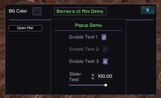
Note that popups are essentially windows too, the only difference is that they will be closed upon pressing outside of its bounds (or releasing the mouse, depending on the behaviour flag passed), so everything that we do inside its begin function is relative to the popup. Inside the popup begin function, the parent window's bounds etc are ignored. With this said, we can now go ahead and add the popup code:
if is_popup_active then
    -- the begin_popup function is very similar to the window:begin function. In this case, the parameters are:

    -- background color
    -- border color
    -- size
    -- start position (relative to the parent window)
    -- is_close_on_release (boolean)
    -- is_triggering_from_button (boolean) -> this is true only if you are using a core.menu.button as trigger, since it has a special internal handling. False otherwise.
    if window:begin_popup(color.new(16, 16, 20, 230), border_color, vec2.new(250, 250), vec2.new(150, 50), false, false, function()

        -- same like before, we add the title and separators
        local popup_title_text = "Popup Demo"
        local popup_text_centered_x_pos = window:get_text_centered_x_pos(popup_title_text)

        window:add_menu_element_pos_offset(vec2.new(popup_text_centered_x_pos, 10))
        window:add_text_on_dynamic_pos(color.green_pale(255), popup_title_text)
        window:add_separator(3.0, 3.0, 5.0, 0.0, color.new(100, 99, 150, 255))

        -- even tho this is a little bit more advanced, it's actually very simple.
        -- we are adding a position offset to the next dynamic element that we are rendering (see what's a dynamic element in the advanced guide).
        -- by doing a window:begin_group(), what we are doing is we are essentially saying that everything inside the begin_group function is a unique dynamic element.
        -- Therefore, the position offset will be applied to all elements inside equally.
        -- So, yes, begin group is used to group stuff, basically. In this case, we are grouping 4 menu elements. (Previously defined outside the render callback, like always)
        window:add_menu_element_pos_offset(vec2.new(250/4, 5))
        window:begin_group(function()
            checkbox1:render("Enable Test 1", "Showcasing ...")
            checkbox2:render("Enable Test 2")
            checkbox3:render("Enable Test 3")
            slider_float_test:render("Slider\nTest")
        end)

    end) then
        -- You can do whatever you want here. If the code here is read it means that the popup is currently being rendered.
    else
        -- This means that the user clicked outside of the popup bounds (or released the mouse), so it shouldn't be rendered anymore.
        is_popup_active = false
    end
end
So far, this is what should be appearing on your screen after you hit the "Open Me!" button:
Intermediates - 3
The Intermediates - Spawning WindowsThis is pretty similar to what we did with the popups. The only difference is that now we need to create a window object and we need to handle its visibility in a different way, since windows by default don't close when pressing outside of its bounds. First, we will generate the button that will trigger the window appeareance, just like we did with the popup:
    local open_window_rect_v1 = vec2.new(13, 120)
    local open_window_rect_v2 = vec2.new(123, 150)

    local alpha2 = 120
    if window:is_mouse_hovering_rect(open_window_rect_v1, open_window_rect_v2) then
        alpha2 = 255
    end

    window:render_rect_filled(open_window_rect_v1, open_window_rect_v2, color.black(alpha2), 1.0)
    window:render_rect(open_window_rect_v1, open_window_rect_v2, color.white(alpha2), 1.0, 1.0)
    window:render_text(enums.window_enums.font_id.FONT_SMALL, vec2.new(open_window_rect_v1.x + 27, open_window_rect_v1.y + 7), color.white(255), "Open Me!")

    if window:is_rect_clicked(open_window_rect_v1, open_window_rect_v2) then
        -- since this is a window, when the user presses the exit cross, its visibility will be set to false automatically. The button was just clicked, so we need to make sure
        -- the window is visible again.
        window_popup:set_visibility(true)

        -- same like with the popup, we declare this variable outside of the render callback.
        is_window_popup_open = true
    end
Now we just need to render this window. Pretty easy, right? Just like we did for the main window:
    if is_window_popup_open then
        -- window_popup:set_next_window_padding(vec2.new(33, 33))
        window_popup:begin(enums.window_enums.window_resizing_flags.RESIZE_HEIGHT, true, color_picker_test:get(),
        border_color, enums.window_enums.window_cross_visuals.DEFAULT, function()

            local window_popup_title_text = "Window Popup Demo"
            local window_popup_text_centered_x_pos = window:get_text_centered_x_pos(window_popup_title_text)

            -- we render the title following the same principles as before
            window:add_menu_element_pos_offset(vec2.new(window_popup_text_centered_x_pos, 10))
            window:add_text_on_dynamic_pos(color.green_pale(255), window_popup_title_text)
            window:add_separator(3.0, 3.0, 15.0, 0.0, color.new(100, 99, 150, 255))

            window:add_menu_element_pos_offset(vec2.new(30, 20))
            window:begin_group(function()
                checkbox1:render("Enable Test 1", "Tooltip Test ...")
                checkbox2:render("Enable Test 2")
                checkbox3:render("Enable Test 3")
            end)

        end)
    else
        is_window_popup_open = false
    end
Intermediates - Last
The Intermediates - SummarySo far, this is all the code that we created:
---@type color
local color = require("common/color")

---@type vec2
local vec2 = require("common/geometry/vector_2")

---@type enums
local enums = require("common/enums")

-- Important: every window must have a unique identifier.
-- In this case, the identifier is "Test window".
local test_window = core.menu.window("Test window - ")

local window_position_elements =
{
    x = core.menu.slider_int(0, 10000, 500, "test_window_x_initial_position_"),
    y = core.menu.slider_int(0, 10000, 500, "test_window_y_initial_position_"),
}

local window_size_elements =
{
    x = core.menu.slider_int(0, 10000, 500, "test_window_x_initial_size_"),
    y = core.menu.slider_int(0, 10000, 300, "test_window_y_initial_size_"),
}

local initial_size = vec2.new(window_size_elements.x:get(), window_size_elements.y:get())
test_window:set_initial_size(initial_size)

local initial_position = vec2.new(window_position_elements.x:get(), window_position_elements.y:get())
test_window:set_initial_position(initial_position)


local bg_color = color.new(16, 16, 20, 180)
local border_color = color.new(100, 99, 150, 255)
local color_picker_test = core.menu.colorpicker(bg_color, "color_picker_test_id_1")

local window_popup = core.menu.window("Window Popup Test")

window_popup:set_initial_size(vec2.new(300, 200))
-- this is relative to the parent window, not relative to screen, unlike the parent window initial position.
window_popup:set_initial_position(vec2.new(500, 500))

local is_window_popup_open = false
local is_popup_active = false

core.register_on_render_window_callback(function()
--     -- I know all these parameters might overwhelm you at the beginning, but don't worry since all these parameters are straightforward and pretty much self-explanatory.

--     -- Parameter 1: Resizing flags -> Accepts window_resizing_flags enum member:    .NO_RESIZE or 0,
--     --                                                                              .RESIZE_WIDTH,
--     --                                                                              .RESIZE_HEIGHT,
--     --                                                                              .RESIZE_BOTH_AXIS

--     -- .NO_RESIZE: The draggable resizing areas will be completely disabled, making it impossible for the user to change the window's size.
--     -- .RESIZE_WIDTH: Only the lateral draggable zone will be enabled, so the user will only be able to increase the window's width.
--     -- .RESIZE_HEIGHT: Only the bottom draggable zone will be enabled, so the user will only be able to increase the window's height.
--     -- .RESIZE_BOTH_AXIS: The bottom-right draggable zone will be enabled, so the user will be able to modify both, width and height.

--     -- Parameter 2: Is adding cross -> Accepts Boolean. The cross refers to the top right X that when pressed will make the window invisible. If false, no cross will be rendered,
--     -- so you will have to manually handle a way to close and open the window (eg. custom buttons).

--     -- Parameter 3: Background color -> Accepts Color

--     -- Parameter 4: Border color -> Accepts Color

--     -- Parameter 5: Cross style flag -> Accepts window_cross_visuals enum member:   DEFAULT = 0,
--     --                                                                              PURPLE_THEME = 1,
--     --                                                                              GREEN_THEME = 2,
--     --                                                                              RED_THEME = 3,
--     --                                                                              BLUE_THEME = 4,
--     --                                                                              NO_BACKGROUND = 5,
--     --                                                                              ONLY_HITBOX = 6,
--     --                                                                              NO_BORDER = 7,
--     --                                                                              NO_BACKGROUND_AND_NO_BORDER = 8,
--     --                                                                              NO_CROSS = 9

--     -- The cross style enum names are self explanatory, but I advise you to play with all these values and see how they change.

--     -- There are up to 3 extra possible parameters that are optional before we add the function call, which is always the last parameter no matter what.
--     -- These parameters are just extra flags that we can add that will alter the way the window behaves. They are inside the enums.window_enums.window_behaviour_flags.
--     -- These flags are:

--     -- .NO_MOVE: Disables the window's movement, so the user won't be able to move the window by dragging it.
--     -- .NO_SCROLLBAR: Disables scrollbars for the window.
--     -- .ALWAYS_AUTO_RESIZE: Window will automatically resize according to the elements, always according to the dynamic spacing size (see advanced guide)

--     -- NOTE: To use the default color, we need to pass color.new(0,0,0,0)

    test_window:begin(enums.window_enums.window_resizing_flags.RESIZE_BOTH_AXIS, true, color.new(0,0,0,0),
    border_color, enums.window_enums.window_cross_visuals.BLUE_THEME, function()
        test_window:add_menu_element_pos_offset(vec2.new(13, 13))
        color_picker_test:render("BG Color")
        test_window:add_menu_element_pos_offset(vec2.new(-3, -3))

        local title_text = "Barney's UI Mini Demo"
        -- With this function we get the exact X position offset required to add to the current dynamic position so the text is in the center of the window:
        local text_centered_x_pos = window:get_text_centered_x_pos(title_text) -- This function accepts a string, returns a number (which is the X offset)

        -- We add the X position offset that we just calculated, and also we adjust the Y position:
        window:add_menu_element_pos_offset(vec2.new(text_centered_x_pos, -32)) -- This function accepts a vec2, returns nothing (the parameter is the position offset)

        -- Finally, we just render the text on the dynamic position that we just set:
        window:add_text_on_dynamic_pos(color.green_pale(255), title_text) -- This function accepts a color and a string. This just renders the string with the color.

        local text_size = window:get_text_size(title_text)
        -- Now we render the rectangle to highlight the title:
        -- This function accepts start_position (vec2), end_position (vec2), color, rounding, thickness and extra flags. The extra flags are covered in the docs, in the function info.
        window:render_rect(vec2.new(text_centered_x_pos - text_size.x / 20 - 3, 12.0), vec2.new(text_centered_x_pos + text_size.x * 1.05 - 1, 37), color.white(100), 0, 1.0)

        -- We finished rendering the title, so let's add some separators:
        -- This function accepts the following parameters: separation from right offset (number), separation from left offset (number), y offset (number), width_offset (number) and color.
        window:add_separator(3.0, 3.0, 15.0, 0.0, color.new(100, 99, 150, 255))
        window:add_separator(3.0, 3.0, 17.0, 0.0, color.new(100, 99, 150, 255))

         -- top-left position of the button rect
        local open_popup_rect_v1 = vec2.new(13, 70)
        -- bot-right position of the button rect
        local open_popup_rect_v2 = vec2.new(123, 90)

        -- we can change alpha if the mouse is hovering our rect, so the user gets visual feedback and knows that the button does something.
        local alpha = 120
        if window:is_mouse_hovering_rect(open_popup_rect_v1, open_popup_rect_v2) then
            alpha = 255
        end

        -- now, we just need to render the rect accordingly

        -- this is the background of the rect
        window:render_rect_filled(open_popup_rect_v1, open_popup_rect_v2, color.black(alpha), 1.0)
        -- this is the borders of the rect
        window:render_rect(open_popup_rect_v1, open_popup_rect_v2, color.white(alpha), 1.0, 1.0)

        window:render_text(enums.window_enums.font_id.FONT_SMALL, vec2.new(40, 71), color.white(255), "Open Me!")

        -- if the window is clicked, then we can do whatever. In this case, we are going to open a popup.
        if window:is_rect_clicked(open_popup_rect_v1, open_popup_rect_v2) then

            -- note: define this boolean outside of the render callback
            is_popup_active = true
        end

        if is_popup_active then
            -- the begin_popup function is very similar to the window:begin function. In this case, the parameters are:

            -- background color
            -- border color
            -- size
            -- start position (relative to the parent window)
            -- is_close_on_release (boolean)
            -- is_triggering_from_button (boolean) -> this is true only if you are using a core.menu.button as trigger, since it has a special internal handling. False otherwise.
            if window:begin_popup(color.new(16, 16, 20, 230), border_color, vec2.new(250, 250), vec2.new(150, 50), false, false, function()

                -- same like before, we add the title and separators
                local popup_title_text = "Popup Demo"
                local popup_text_centered_x_pos = window:get_text_centered_x_pos(popup_title_text)

                window:add_menu_element_pos_offset(vec2.new(popup_text_centered_x_pos, 10))
                window:add_text_on_dynamic_pos(color.green_pale(255), popup_title_text)
                window:add_separator(3.0, 3.0, 5.0, 0.0, color.new(100, 99, 150, 255))

                -- even tho this is a little bit more advanced, it's actually very simple.
                -- we are adding a position offset to the next dynamic element that we are rendering (see what's a dynamic element in the advanced guide).
                -- by doing a window:begin_group(), what we are doing is we are essentially saying that everything inside the begin_group function is a unique dynamic element.
                -- Therefore, the position offset will be applied to all elements inside equally.
                -- So, yes, begin group is used to group stuff, basically. In this case, we are grouping 4 menu elements. (Previously defined outside the render callback, like always)
                window:add_menu_element_pos_offset(vec2.new(250/4, 5))
                window:begin_group(function()
                    checkbox1:render("Enable Test 1", "Showcasing ...")
                    checkbox2:render("Enable Test 2")
                    checkbox3:render("Enable Test 3")
                    slider_float_test:render("Slider\nTest")
                end)

            end) then
                -- You can do whatever you want here. If the code here is read it means that the popup is currently being rendered.
            else
                -- This means that the user clicked outside of the popup bounds (or released the mouse), so it shouldn't be rendered anymore.
                is_popup_active = false
            end
        end

        -- now, the window popup code:

        local open_window_rect_v1 = vec2.new(13, 120)
        local open_window_rect_v2 = vec2.new(123, 150)

        local alpha2 = 120
        if window:is_mouse_hovering_rect(open_window_rect_v1, open_window_rect_v2) then
            alpha2 = 255
        end

        window:render_rect_filled(open_window_rect_v1, open_window_rect_v2, color.black(alpha2), 1.0)
        window:render_rect(open_window_rect_v1, open_window_rect_v2, color.white(alpha2), 1.0, 1.0)
        window:render_text(enums.window_enums.font_id.FONT_SMALL, vec2.new(open_window_rect_v1.x + 27, open_window_rect_v1.y + 7), color.white(255), "Open Me!")

        if window:is_rect_clicked(open_window_rect_v1, open_window_rect_v2) then
            window_popup:set_visibility(true)
            is_window_popup_open = true
        end

        if is_window_popup_open then
            -- window_popup:set_next_window_padding(vec2.new(33, 33))
            window_popup:begin(enums.window_enums.window_resizing_flags.RESIZE_HEIGHT, true, color_picker_test:get(),
            border_color, enums.window_enums.window_cross_visuals.DEFAULT, function()

                local window_popup_title_text = "Window Popup Demo"
                local window_popup_text_centered_x_pos = window:get_text_centered_x_pos(window_popup_title_text)

                window:add_menu_element_pos_offset(vec2.new(window_popup_text_centered_x_pos, 10))
                window:add_text_on_dynamic_pos(color.green_pale(255), window_popup_title_text)
                window:add_separator(3.0, 3.0, 15.0, 0.0, color.new(100, 99, 150, 255))

                window:add_menu_element_pos_offset(vec2.new(30, 20))
                window:begin_group(function()
                    checkbox1:render("Enable Test 1", "Tooltip Test ...")
                    checkbox2:render("Enable Test 2")
                    checkbox3:render("Enable Test 3")
                end)

            end)
        else
            is_window_popup_open = false
        end
    end)
end)
And this is what you should be seeing, after running this code in-game:
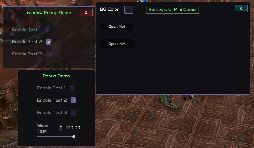
If you noticed, in the first image, on the right of the main window, there are some drawings that we havn't covered yet. Try to do that yourself as an excercise.
You will need to use the following functions: window:render_circle_filled, window:render_circle, window:render_triangle_filled_multicolor, window:render_rect_filled_multicolor, window::render_bezier_quadratic, window:render_bezier_cubic, window:render_text. However, you can be creative, look into the documentation the different possibilities available and make your own design, or if you have ideas, you can always request more features.
Advanceds - 1
The Advanceds - AnimationsIf you look closely at the first image, you will notice there are some random circles on the left. These circles are not static, but animated. You are more than welcome to do your own animations, but our windows provide a simple feature to animate widgets. First, we just need to declare the animations (they behave like independant objects)
    -- parameter 1: the id of the animation (integer)
    -- parameter 2: the starting position of the animation (vec2)
    -- parameter 3: the ending position of the animation (vec2)
    -- parameter 4: the starting alpha of the animation (integer)
    -- parameter 5: the ending (max alpha) of the animation (integer)
    -- parameter 6: alpha speed (integer)
    -- parameter 7: movement speed (integer)
    -- parameter 8: animate only once (boolean)
    local animation = window:animate_widget(1, vec2.new(0,0), vec2.new(50, 300), 0, 100, 100, 50, false)
    local animation2 = window:animate_widget(2, vec2.new(0,0), vec2.new(180, 300), 0, 100, 80, 60, false)
    local animation3 = window:animate_widget(3, vec2.new(0,0), vec2.new(210, 300), 0, 100, 100, 50, false)
    local animation4 = window:animate_widget(4, vec2.new(300,0), vec2.new(50, 300), 0, 100, 105, 50, false)
The animation objects that we just created are returning a table. This table contains 2 elements:
1 - current_position (vec2)
2 - alpha (integer)
We are going to use these values to now draw our widgets accordingly:
    window:render_circle(animation.current_position, 10.0, color.new(100, 99, 150, animation.alpha), 3.0)
    window:render_circle(animation2.current_position, 10.0, color.green_pale(animation2.alpha), 3.0)
    window:render_circle(animation3.current_position, 10.0, color.green_pale(animation3.alpha), 3.0)
    window:render_circle(animation4.current_position, 10.0, color.new(100, 99, 150, animation3.alpha), 3.0)
And that's it. We now have some animated circles.
Advanceds - 2
The Advanceds - Explaining Dynamic Drawing
If you remember, in the previous section we used window:add_menu_element_pos_offset() and :add_text_on_dynamic_pos() function.. I will try to explain how our windows work internally, giving a brief overview so you can understand how this works, more or less.
So, there are 2 ways to draw stuff in a window:
- Statically: function. this is very simple, since you are just basically hardcoding where you want to draw things, and they will be drawn there, not caring about other things that are currently being rendered in the window etc. (Note that all positions that you pass to the functions that draw statically are relative to the current window position, not the screen position. So, if you pass vec2(100, 100), the actual position would be vec2(100 + window_position.x, 100 + window_position.y))
- Dynamically: function. this is a little bit more complex to work with. Let's say there is an internal position variable. This variable's value is a vec2, and it changes according to the dynamic widgets that we render. For example, if the internal position variable currently has value vec2(100, 50) and we render something dynamically (a text, for example), this text will be rendered at the position vec2(100, 50) and this internal position variable will change according to the text bounds. Let's say the text size is vec2(50, 50). In this case, the internal position variable will be (after rendering the text), vec2(150, 100). So far, this doesn't sound too bad, and the only native dynamic drawing functionality (by native I mean the only function that allows you to directly draw in the internal position variable) is the :add_text_on_dynamic_pos function.
However, we can still do cool stuff with this dynamic position offset, since we can manually add space. For example, we can just render a rectangle and then add the rectangle bounds to this internal position variable, so it's taken into account for multiple stuff (for example, scrollbars are dependant on the internal position variable). To do this, we have to use the function :add_artificial_item_bounds function.
By using :add_menu_element_pos_offset, :get_current_context_dynamic_drawing_offset, :add_artificial_item_bounds you can achieve very interesting results.
Check the "Panel Debug Target - Show Auras Info" to dive deeper into this matter and see some use examples. In this case, I am using static text drawings and making them dynamic, so we can use the scrollbar (necessary since there are many auras and they don't fit on the screen), and also the "Remaining" is a number that varies a lot with time. If we didn't use static text, since the dynamic text varies according to the previous widgets sizes, all the line would have a very ugly flickering all the time, according to the "Remaining" number text size.
Best regards, Barney